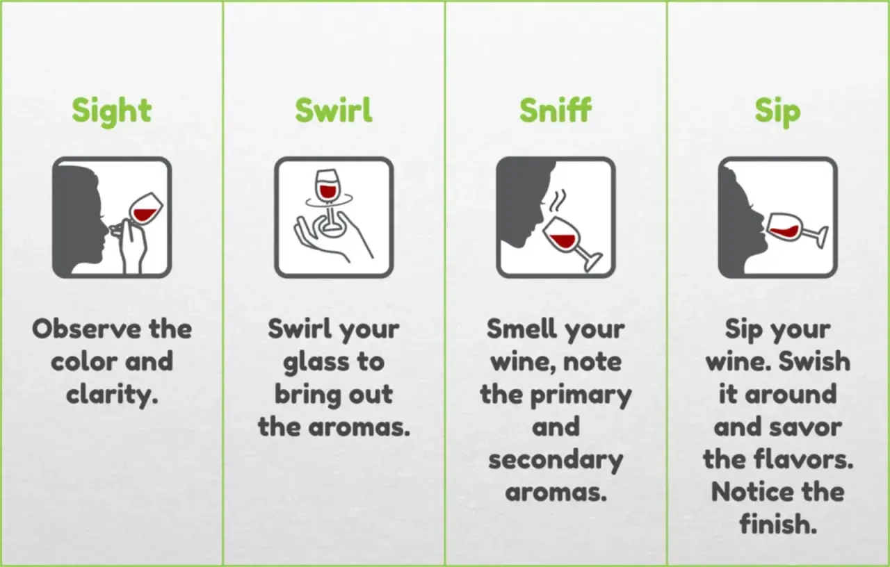
The colour gives fast clues, but it only makes sense when you read the whole glass
- Hue tells you the general colour family, such as straw, ruby, garnet, salmon, or amber.
- Intensity hints at extraction, grape skin contact, age, and sometimes body.
- Younger wines usually show brighter, clearer colours; older wines often soften at the rim and deepen toward brick or gold.
- Colour alone cannot tell you sweetness, price, or quality with any reliability.
- Food pairing becomes easier when you use colour as a guide to freshness, weight, and savoury depth.
What the glass tells you before the first sip
When I look at a wine, I start with three things: hue, depth, and condition. Hue is the family of colour itself, depth is how concentrated the colour appears, and condition is whether the liquid looks bright, cloudy, or tired. Together, those details can suggest the style of wine far more quickly than a tasting note ever could.
The important thing is not to overread a single clue. A pale white wine may be light-bodied and brisk, but it may also be a mature style that has simply softened with time. A deep red can be powerful and tannic, yet it can also come from grape skin contact, oak ageing, or the natural colour of the variety. I find it more useful to think of colour as a first filter, not a final answer.
That is why the same glass can tell two different stories at once: what the wine is today, and how it was made. From there, it becomes easier to compare the major colour families side by side.

How the main styles read at a glance
The broad colour families are easy to recognise once you know what to look for. In practice, I use them to narrow expectations before I even check the aroma.
| Style | Common hues | What it often suggests | Typical food fit |
|---|---|---|---|
| Red wine | Purple, ruby, garnet, brick | Skin contact, tannin, and a colour that usually softens with age | Grilled lamb, mushrooms, bean stews, cured meats |
| White wine | Greenish straw, straw, gold, amber | Freshness at the pale end; age, oak, or oxidation as the colour deepens | Fish, shellfish, pintxos, creamy sauces, fried snacks |
| Rosé | Onion-skin, salmon, coral, light cherry pink | Limited skin contact and a style built around freshness | Tapas, charcuterie, grilled tuna, vegetables, picnic food |
| Orange wine | Gold, amber, copper, apricot | White grapes made with extended skin contact, which adds grip and colour | Aged cheese, roasted vegetables, mushrooms, savoury dishes |
| Sparkling wine | Pale straw, gold, blush pink | Usually the base wine matters more than the bubbles themselves | Oysters, fried bites, salty snacks, celebration plates |
For a Basque table, this matters more than people sometimes admit. A pale, brisk white can be exactly right for anchovies, grilled hake, or a plate of pintxos, while a rosé usually feels more flexible with chorizo, roast peppers, or tuna. The deeper the colour, the more I expect savoury depth and a bit more weight on the palate.
That leads naturally to the part most people notice last: how the shade changes as the wine ages.
Why the shade changes as wine ages
Age affects colour in predictable ways, though not every wine evolves at the same pace. In red wines, the youthful purple and ruby tones gradually move toward garnet, then brick, and eventually brownish edges if the wine is old enough. That happens because pigments called anthocyanins slowly change over time, especially as tannins polymerise and drop out of suspension.
White wines move in the opposite visual direction. A young white often looks pale straw or greenish-gold, then becomes richer gold, and later amber if oxidation or bottle age keeps progressing. I pay close attention to that shift because it often tells me more about maturity than aroma alone does.
Rosé is less predictable because the styles are so varied. Some are intentionally pale and delicate, while others are fuller and darker, almost cherry-coloured. Orange wines, by contrast, get their colour from skin contact during fermentation, which is simply the time juice spends in contact with grape skins. That extra contact also adds grip and texture, so the colour is doing real work rather than just looking decorative.
Not every change is a warning sign. Oxidation can be a fault in a fresh white wine, but it is also part of the intended style in wines such as fino sherry or certain amber wines. The trick is to judge colour in context, which is where a bit of tasting practice saves a lot of guesswork.
How I read a glass in practice
When I taste, I do not stare at the wine for drama. I keep the process simple and repeatable.
- Hold the glass against a white background. A napkin, tablecloth, or plain sheet of paper makes colour easier to read than a busy surface.
- Check the centre and the rim separately. The core shows intensity; the edge often reveals age or oxidation more clearly.
- Look for brightness as well as shade. Clear, lively colour usually feels healthier than a dull or muddy appearance.
- Watch for colour transitions. A purple core with a brick rim suggests youth giving way to maturity, while a gold rim on a white may point to age or oak influence.
- Notice cloudiness only in context. Cloudy wine can be unfined, naturally made, or simply faulty, so I never judge it without smelling it first.
Once you know how to read the glass, the next question is just as important: what colour cannot tell you.
What colour cannot tell you on its own
This is where people most often overreach. Darker does not automatically mean better, richer, more expensive, or more ageworthy. A pale red may be delicate and complex, while a deep, inky bottle may simply be extracted or heavily oaked. The same goes for white wine, where a deeper gold tone may come from age, oak, grape variety, or deliberate winemaking rather than quality.
Colour is also a weak predictor of sweetness. A dry white can look golden; a sweet white can look pale. Sparkling wine is even trickier, because a pale colour says more about the base wine and the style than about sweetness or complexity. If I want to know whether a wine is dry, sweet, or full-bodied, I still have to smell and taste it.
Another common mistake is assuming that clarity equals quality. Some modern wines are intentionally cloudy because they are minimally filtered, and that can be perfectly valid. On the other hand, a wine that looks a little tired, brown, or flat may be oxidised, overaged, or simply past its best. Colour tells me where to look next, not what conclusion to jump to.
That distinction matters even more when food enters the picture, because the best pairing decisions come from reading both the wine and the dish with the same level of care.
Pairing the shade with a Basque-style meal
On a Basque table, I think in terms of freshness, salt, smoke, and texture. Colour helps me decide which wines can keep up with those elements without flattening the meal.
- Pale, brisk whites work well with anchovies, grilled fish, clams, salt cod, and crisp pintxos because the colour usually signals lightness and acidity.
- Rosé is a reliable middle ground for charcuterie, tuna, roast peppers, tortilla, and lighter grilled dishes when you want freshness without losing versatility.
- Translucent reds suit lamb cutlets, mushrooms, bean dishes, and anything with smoke or paprika, especially when you want some structure but not heavy tannin.
- Orange or amber wines can be excellent with savoury vegetable dishes, mature cheeses, and umami-heavy plates where a little grip helps the wine stand up.
In the Basque Country, a pale, lively white such as txakoli is often the first bottle I would reach for with seafood and pintxos because its bright appearance usually matches its crisp, saline personality. The lesson is not that colour decides the pairing, but that it quickly points me toward the right weight and mood for the meal.
From there, the final step is using colour as a practical buying tool rather than a source of false certainty.
A simple way to choose better from the shelf
When I stand in front of a shelf or a wine list, I use colour to narrow the field fast. If I am serving grilled fish or shellfish, I usually look for pale whites, young sparkling styles, or a very light rosé. For roasted meat, mushrooms, or slow-cooked dishes, I lean toward deeper reds or more structured amber styles. That simple match is often enough to avoid obvious mismatches.
My rule is straightforward: start with colour, confirm with context, and only then decide. If the wine looks unusually deep, unusually pale, or visibly aged, I ask why before I buy. Sometimes the answer is the grape. Sometimes it is the cellar. Sometimes it is the style of the wine itself. The best results come from treating colour as a useful clue, not a shortcut.
That is why I think colour is still one of the most practical parts of wine tasting. It can lead you toward the right bottle, the right food, and the right expectation, as long as you remember that the real story only begins once the glass is in your hand.
